With this release we are moving closer to getting TROMjaro XFCE out of Beta. And for that reason we are releasing two versions. Let me explain the “them” and the “why”.
TROMjaro Modern.
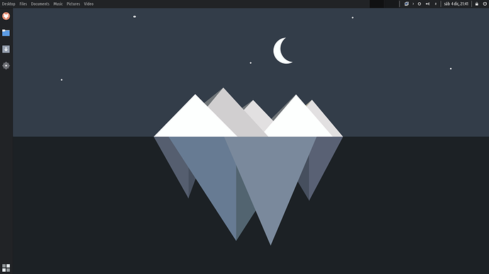
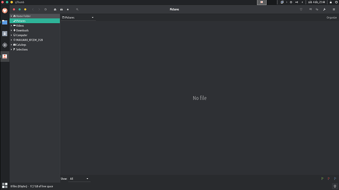
TROMjaro Modern is similar to our original TROMjaro Gnome. We wanted a left side apps panel, and a top bar for activities. With XFCE we managed to include global menus so the transformation was complete.
Beautiful global menus, very nice and compact UI that allows windows to expand to the top panel.
However this didn’t work 100% of the time. There were a few inconsistencies:
- Several new apps are using CSD (Client Side Decorations) and that means they do not have a traditional top bar anymore, making it impossible to “expand” into the top bar. And so you end up with two sets of window buttons as such:
This can be very confusing. We reported the issue here, but so far no sign that it will be fixed.
-
The top global menus only worked for some 70% of all apps from our tests. The same CSD windows are also bad at exporting the menus so they usually cannot have a global menu. And rarely some apps had a proper top menu but it was not being exported to the top panel. Overall I’d say some 70% of all apps worked with the global menu, some 25% kept their own hamburger menu and did not export any, and the rest had a traditional menu but it was not exported as a global menu. We think this may create confusion. This issue with apps not exporting the menus is debated for years now and it seems there is no fix to this since more and more developers choose to not properly export the menus of their apps. They seem to not care about this, despite the fact that it can be very useful, even for people with disabilities that can use all kinds of software to read through such menus. But well, it is something we cannot do anything about…
-
The fact that menus are on the top bar, even when windows are not maximized, can be confusing for some.
-
Maybe there are more reasons that I do not remember now.
Overall this Modern layout is as good as such a layout gets on Linux. I use it personally and I love it. It is geared for people who do video/photo editing and need more screen space.
TROMjaro Classic.
TROMjaro Classic is meant to fix the above inconsistencies so we are able to provide a TROMjaro ISO that is a lot more stable and consistent. Mind you, the changes are only design wise and a package less.
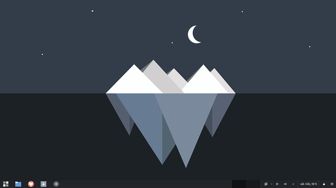
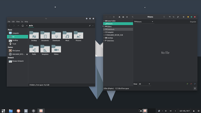
Because there is one single panel, and it is located at the bottom like in most Operating Systems, it is more familiar to newcomers. We’ve also removed the global menus so apps look a lot more consistent, regardless if they are CSD or non-CSD.
We’ve also moved the window buttons to the right. They make sense to the left when used in the Modern version.
So why two?
Simply because one is based on our original intent to provide a more unique looking distro (Modern) with global menus, but if users want more consistency they can choose the Classic version. This way we keep an original approach and a more consistent one too, at the same time.
One can create any of those layouts very very easily. And we will add tips about how to do that, very soon, to our Tips category.
Changes:
Here are the changes that we’ve done for this release:
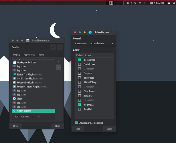
- We obviously changed some stuff for the panels. Mainly we changed this little human menu from the right corner

with the Action Buttons plugin. So right click that little human (can be black now, hence the reason we are changing this) and then remove. Then right click on the top panel and add a new item (Action Buttons). Drag it to the same position and make sure you have these selected:
Now to improve the icons situation. Copy these icons to the .local/share/icons/Zafiro/apps/scalable/ and to .local/share/icons/Zafiro/actions/48/ folder. Overwrite if you are asked to. Now refresh the desktop if you can’t see the changes: Ctrl+Alt+Del.
- We replaced the default lock screen app (
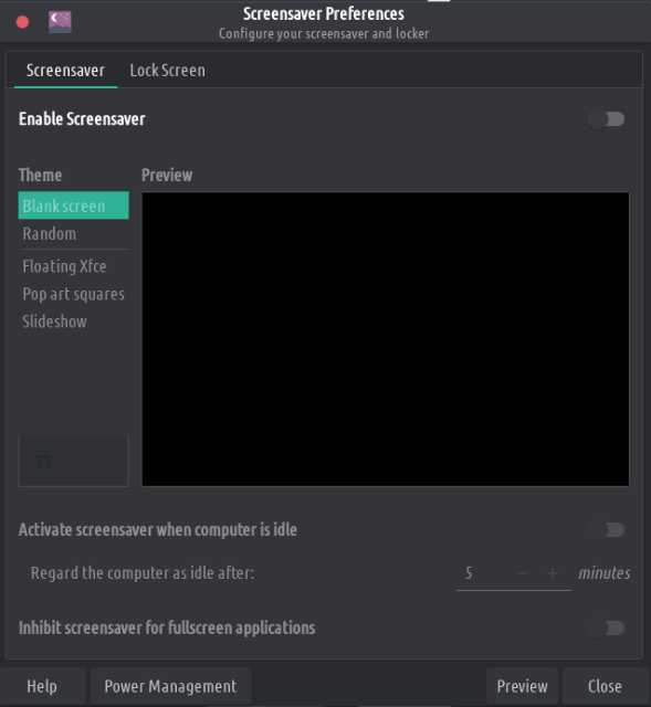
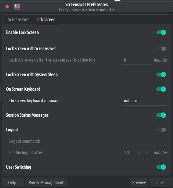
light-locker) with XFCE’s default calledxfce4-screensaver. Remove the first and install the second via Add/Remove Software. Then open the Screensaver app and do these changes:
You may have to reboot your computer for this new Lock Screen to take effect.
-
We remove the terminal transparency simply because it was fully transparent on some systems after the OS was installed, But you can make it transparent manually via the terminal’s preferences.
-
We fixed a bug with the Archive Manager. Go to
/.local/share/applications/and remove a desktop file that hasFileRollerin the name. -
On desktop the mouse pointer will disappear when there is no movement. This can be confusing. We did this for touchscreen devices that are only used without a mouse. To remove this annoyance go to
.config/autostart/and remove the fileUnclutter.desktop. Reboot your system. -
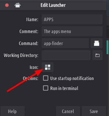
We have removed the Whisker menu from our panels and replaced it with AppFinder. We wanted 1 single app finder/menu, not two. Simply right click the APPS button and remove. Then add a new item (a launcher) for AppFinder. As such:
It is easy. If you want to use a similar icon search for view-list-icons in the icons.
Oh and the wallpaper you see is probably going to be the default TROMjaro wallpaper. If you want it, grab it from here.
That’s all I guess! Grab the ISOs from here.
