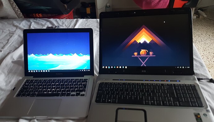
This is a big and important update for TROMjaro, and we made so many little changes that I can only highlight the most noticeable ones. In essence, I want TROMjaro to be very user friendly from the get go. I recently fixed 2 laptops, a Macbook Pro from 2009 and a HP Pavilion from 2007, and I installed TROMjaro on both of them.
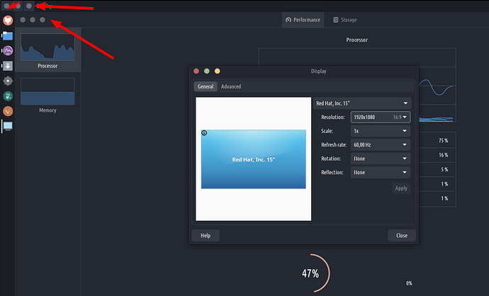
But I realized that our default Unity layout is strange for the people coming from Windows. The global menus do not work at times with some apps, when you maximize a CSD (Gnome mainly) window you get a double set of window buttons, one for the window itself one for the top bar. Plus it won’t scale well since XFCE changed the Panel height value from percentage to px. So if you have different resolutions, then the left side bar will go on top or under the top bar…
This may not be that visible but it is still not scaling up well.
Changing the default layout
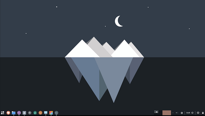
Overall our Unity layout is kinda “experimental”, and so is the MacOS one. Therefore I labeled them as such in our layout switcher and I chose the Windows layout as the default one.
This is by far the most familiar layout out there and is bugs free. Scales up perfectly fine, no more double window buttons or issues with maximizing the widows. TROMjaro users should have a functional desktop experience from the get go!
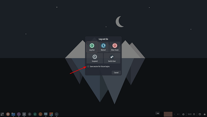
I also improved it a bit by adding the clock in between 2 separators to make it stand out, and 2 essential buttons. One is the Session button that opens up the Session dialogue for shutting down, reboot, logout and all that.
This dialogue also allows you to save the session so next time you boot, all of the windows and tabs will be restored. May not be 100% accurate but very close to that. Before we were using two ways of doing these actions, one from the device power button (press it and get that popup that allows you to also save your session) and a set of buttons on the APPS menu that would not give you the option to save your session. In essence it could end up in a mess where you save your session but then reboot using the APPS menu buttons and on boot you’ll get your old session back…anyway…
Basically there were 2 ways of rebooting/shutting down and such, your device. Now it is only ONE. No more confusion and messiness.
The other button I added is the lock screen one. Makes sense I guess.
I updated all of the Layouts profiles to reflect these changes!
Custom GTK CSS
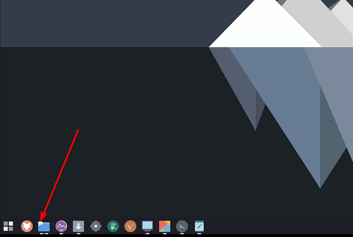
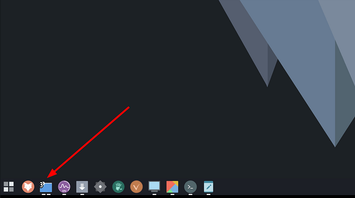
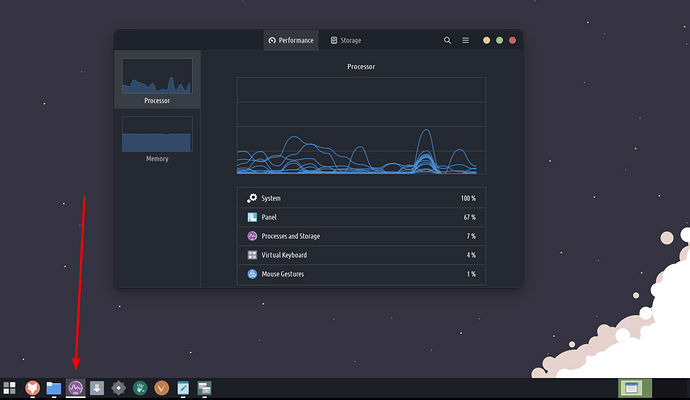
When you have more than 3 windows opened for any app, you should get a number label on top of that Window icon. But can you see it?
Well, I fixed that as best as I could. Now it looks like this:
To do that too, go to /.config/gtk-3.0/ and edit the file gtk.css . Make sure you add this:
/* Make opened windows count number more visible */
#docklike-plugin .group .window_count  {
font-size:20px;
color: white;
text-shadow: 2px 0 #000, -2px 0 #000, 0 2px #000, 0 -2px #000,
2px 0 #000, -2px 0 #000, 0 2px #000, 0 -2px #000,
1px 1px #000, -1px -1px #000, 1px -1px #000, -1px 1px #000,
1px 1px #000, -1px -1px #000, 1px -1px #000, -1px 1px #000;}
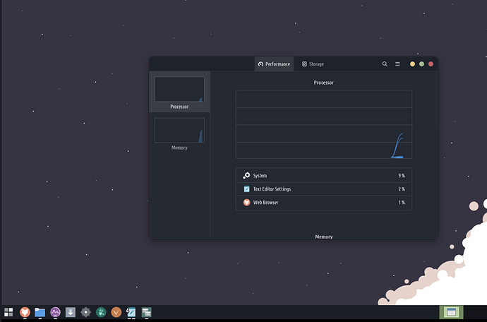
I also tweaked the Docklike and added a little piece of CSS code to better highlight the buttons on the panel. For example before when a window was in focus you would see this:
Can you tell which one is in focus by looking at the Apps panel? No!
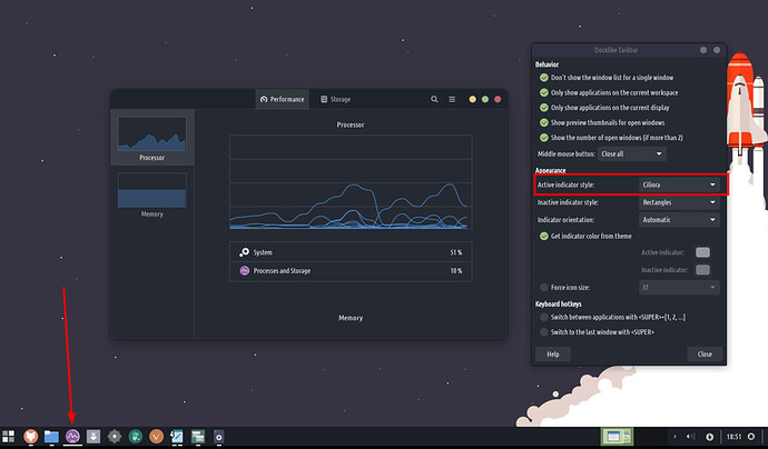
To fix it we added this in the Docklike Settings:
Now the little rectangles of the opened app will expand to a full line when an app window is in focus.
But we need to make it better. In the same gtk.css add this code:
/* Highlight active and hover group for the panel app icons */
#docklike-plugin .active_group { background-color: alpha(white, 0.2); }
#docklike-plugin .hover_group { transition: background-size 0.3s ease; background-image: linear-gradient(to right, rgba(255, 255, 255, 0.1) 0%, rgba(255, 255, 255, 0.1) 0%);}
Now it looks like this:
Much better usability!
Lastly I added some spacing for the apps icons on the panel with:
/* Better padding for the panel app icons */
#docklike-plugin button {padding: 5px;}
I suggest to remove any old code from that file that was about #docklike-plugin button
Restart the panels with CTRL + ALT + 1 to see the changes.
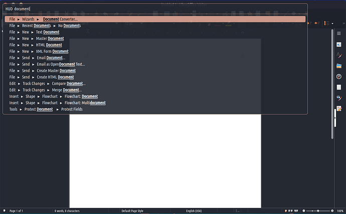
HUD wider
A simple change to make the HUD wider, else some menu elements cannot fit.
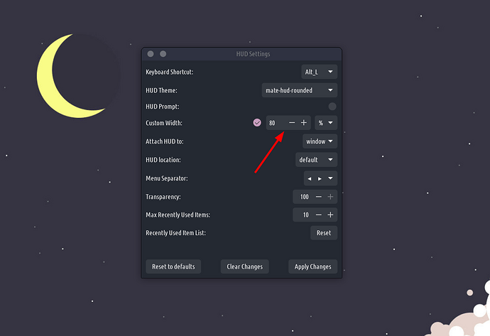
To do that go to the HUD Settings and choose the width to be 80% or so:
Virtual keyboard
I have a convertible laptop so at times I use TROMjaro in tablet mode, but one very annoying thing was the virtual keyboard that may or may not trigger when I needed it. We gave our old Windows 2013 tablet to a friend, and I had TROMjaro on that tablet. But because the tablet had no physical keyboard I had to find a better solution for the Virtual Keyboard.
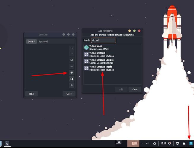
So now you can create a toggle! If you use a tablet device add a new item to a panel. Right click (or tap with 2 fingers at once) on a panel, then add new items. Click to add a Launcher. Now right click the Launcher, then Properties. And do this:
Then you’ll have a Virtual Keyboard toggle that you can always tap to activate or deactivate it. Simple yet essential!
For the current TROMjaro users the command used for this toggle is dbus-send --type=method_call --print-reply --dest=org.onboard.Onboard /org/onboard/Onboard/Keyboard org.onboard.Onboard.Keyboard.ToggleVisible.
Of course, right click the toggle then click Move in order to drag it anywhere on any panel.
Appfinder
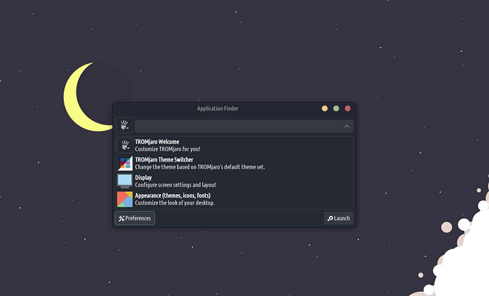
A small change, the view is switched from icons to list because it is more simple and functional. Before, when we were using the icon view, things were not as neat and functional. The AppFinder is something for your keyboard: you press the Super key and start to type. You may want to use your arrow keys to select what you want. In icon view you had to type, then press the arrow keys down twice in order to navigate through the icons. Plus you have to use all of the arrow keys to go to the desired app. Now it is one key, the down key, to select from a list.
Better usability!
The new Theme Switcher and Flatpak fix
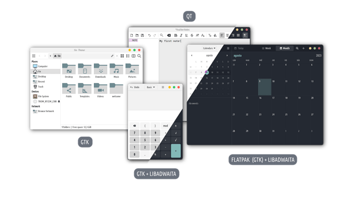
I cannot accept that when a system allows you to change the theme, icon pack, or font, this won’t be respected by all, or at least most apps. When I change the theme, I EXPECT it to be applied everywhere. We had long discussions about this, but it seems more complicated than it should be. If you were to use TROMjaro - pure XFCE, without our fixes, and install a GTK app, a GTK plus Libadwaita one, a QT, and a flatpak, or a flatpak that’s also using Libadwaita, then ALL of these will have different themes, icons and fonts.
And guess what? Most apps are a mix of these. It’s not like this would be a rare situation.
We already fixed most of these but the only ones that we could not, were the flatpaks that were using Libadwaita, and it seems most flatpaks do use that. Now we fixed it, and MORE.
A new theme!
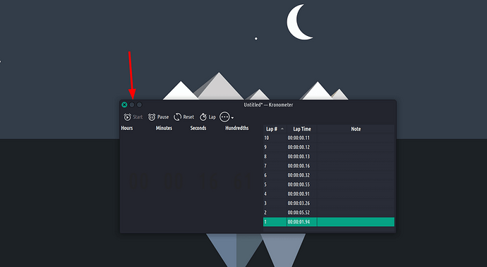
Our previous Skeous theme had a bunch of issues that I was not happy with. The window maximize and minimize buttons were almost invisible:
The theme was not very adapted to GTK4 and not updated in a while…Plus I did not like the contrast that much. Oh and their HiDPI support was not great.
Colloid is the future! ![]()
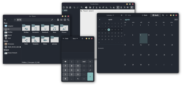
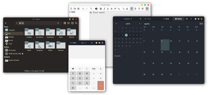
Our new theme is called Colloid and it is an actively developed theme that works great with, well, everything!
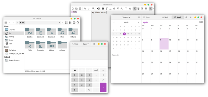
Different styles:
And it comes in so many variations! As you can see now the window buttons are SANE. I think using colors for those buttons is the best approach because for one it is clear where the window buttons are, and then it is even more clear that RED closes the window, while YELLOW minimizes it. In my view this is far better than the traditional icon-based approach.
Install from here.
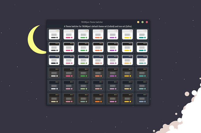
The new theme switcher looks like this:
I think it is quite clear now how each button will tweak your system ![]()
Sync sync sync
Thanks to @rokosun for coding this entire mess! But hey, we did something special. The script for syncing the themes is saner and works better. Here:
Now finally I can use flatpaks on my desktop, since most are GTK or GTK + Libadwaita, and now they all respect me and the system. But there is a small catch here…
In order for us to do this we have to kinda control the .themes folder in your home directory. Flatpaks need access to this folder and we force them to search for the current system theme in that folder and apply that to all GTK flatpaks. But the themes are not normally there, they are in the system’s files. So our script detects when you change a theme, copies it, and pastes it into the .themes folder, and forces flatpaks to use it. Therefore DO NOT use the .themes folder to put any themes because they will be nuked.
So how do you add custom themes and install manually? Use the .local/share/themes - if you put the theme X there, it will automatically sync with the .themes folder if you enable the X theme for your system. So no issues really! But keep that in mind!
HiDPI
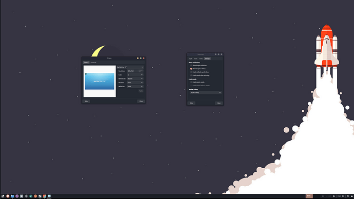
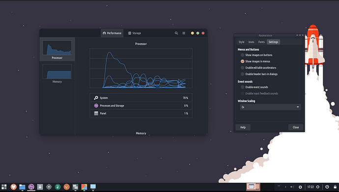
Nowadays many people have high resolution screens and they need a desktop that can adapt to it. A 4k screen with a 4k resolution looks like this:
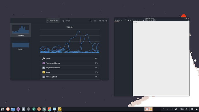
No way you can use it. Too small. But XFCE has an option to increase the DPI by 2X. Meaning everything will become like this:
Bummer! Look at the top bar for the right window. Those buttons and the top bar do not scale up. This is the default XFCE…both apps are GTK, but they deal in different ways with the top bar.
Worse is when you open a QT app:
Everything is so small because the QT apps do not scale at all. And the mouse pointer is going to be so small you can barely find it on your screen.
So imagine this: a user installs XFCE on a device that has a 4k monitor. He then figures that the 2X scaling option is how you make everything look normal/usable while preserving the crisp 4k resolution. The user does that and now he has a broken desktop. BAD!
In order for the user to fix this he has to read some archwiki entries and tweak a lot of things in the system. Terrible!
We fix it automatically!
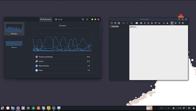
When a user changes to 2X scaling we automatically sync the main theme with everything else like explained in the theming section above, but also the top bar for the GTK windows. All looks the same:
As for the QT we fix it but the user needs to log out for the changes to apply so we show a popup window asking the user to logout in order for the changes to apply for the QT apps as well. Yes it is not fun to logout if you increase the scaling to 2X, but it is definitely no fun to try and fix all of these yourself.
As for the mouse pointer if the user didn’t change the mouse pointer before, we scale it up or down depending if they select to scale or downscale back. So the mouse follows the changes. But if the user changes the mouse pointer himself we wont touch that basically. We assume he knows what he is doing and we don’t want to reinforce a custom mouse pointer sizes.
Please understand how terrible the desktop experience is if you do not have these things sync automatically. No one will fix these unless they are REALLY passionate about using XFCE…
Take a moment to appreciate Roko
This guy is the mastermind behind making all of these into this code. And he did it ALL on a bloody mobile phone…his laptop unfortunately broke and while he waits for a repair shop to fix it, he somehow managed to code everything on the phone. He is a brilliant human and such a great friend! Thank you!!! We should all appreciate you!
Take another moment to appreciate what we did here
We made TROMjaro functional! When you change the theme it changes it for everything. Except for the flatpaks QT that seem impossible to sync. But this is something we may fix in the future. Therefore in TROMjaro the theme, icons, and fonts consistency is, I say, the best in any Linux distribution out there. If others do it better, show us! ![]()
We are also fixing the XFCE HiDPI by making it usable.
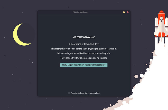
TROMjaro Welcome
We can’t just do this and not brag about them, right!? ![]()
I and Roma worked on a really cool Welcome Screen for TROMjaro. It starts with a bite size info about TROMjaro and why trade-free matters:
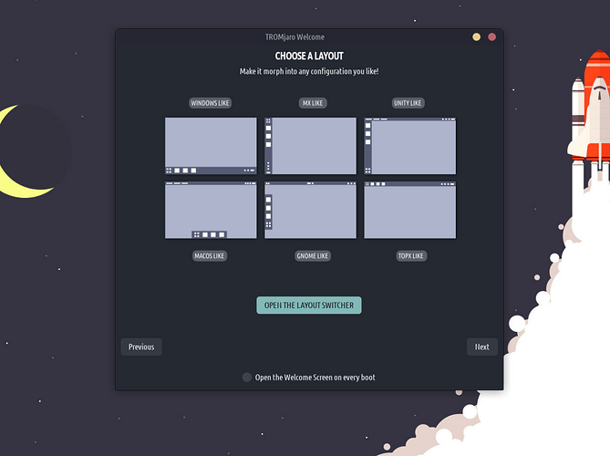
Next you can choose a layout configuration for your system:
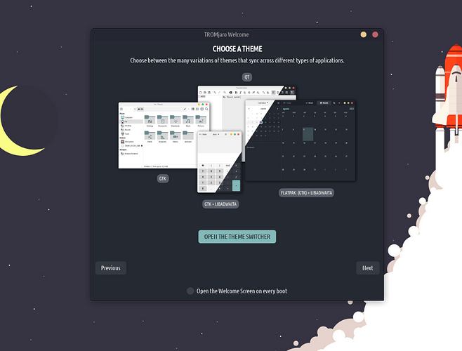
And then a theme ![]()
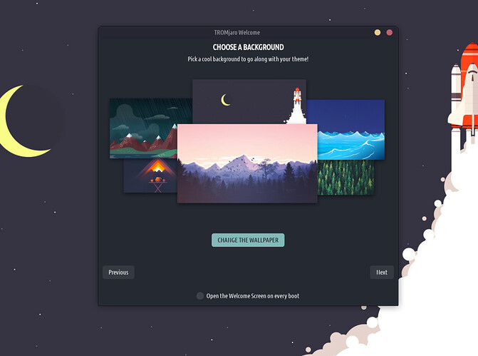
And of course a cool wallpaper:
Speaking of that we changed the default wallpaper for a better “contrast” and to add a bit more color. I’ve also deleted some wallpapers and added new ones. Maybe in the future we can create a default background from scratch, something original :).
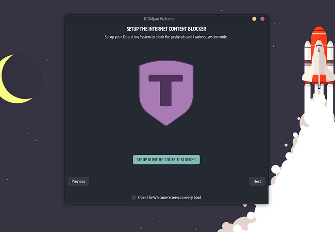
Now configure your Internet Content Blocker to stop the pesky trade-based practices that violate your brain:
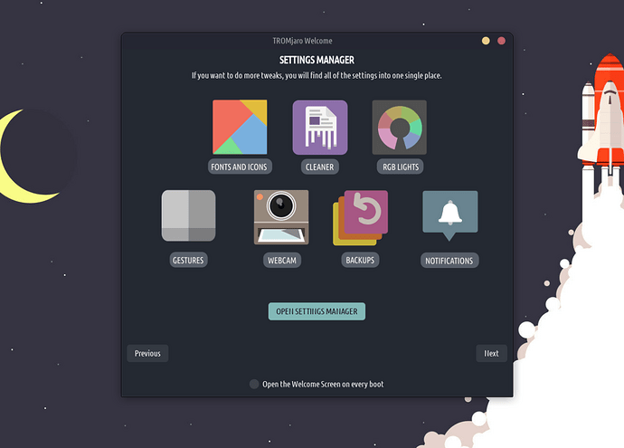
We also want to make people aware that they can find all of the tweaks in the Settings Manager, because we added custom apps there too:
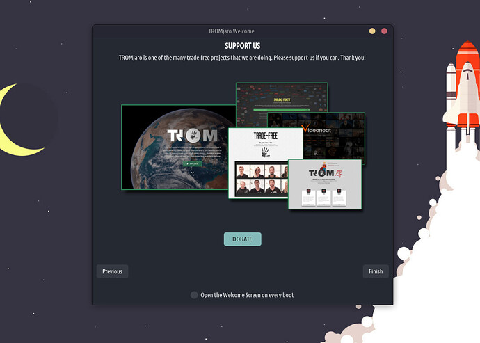
And lastly, we want for people to understand that TROMjaro is just one of the many awesome projects that we are doing and ask for support:
Cool, ha!?
Please support us 
It takes a lot of time to do all of these and test, and all that. And I work full time for TROMjaro and 20 more TROM projects. Currently I get around 200-250 Euros a month in donations which is of course not enough to survive. Luckily we have a sane donation campaign for which we only need 200 people to donate 5 Euros a month to support ALL of our projects. Please, if you use TROMjaro consider helping us.
