Reading this article about libadwaita and how pity the arguments are in favor of using it. I was expecting more.
Basically they argue that they use libadwaita since custom themes were not always perfect and people were reporting issues with apps because of that, and the devs were annoyed because these were issues with the themes and not the app itself. That’s the main idea. Such a weak argument. Let me explain.
1. Linux is variety and it will continue to be. Get used to it, Gnome!
We are talking about Linux here. Multiple kernels, multiple distros, multiple desktop environments. This is a world of variety so of course there will be some sort of inconsistency in some regards. If I use theme A and 1 out of 10 apps doesn’t look that good, then I think that’s acceptable considering this huge variety in the Linux world. So Gnome seems to not understand that this is the nature of Linux. And they won’t change it. What now, make the Gnome apps not run on XFCE, Mate, Arch, kernel 5.4 just because they are not the official Gnome + whatever kernel they use, and they may not be 100% looking and behaving like on the original gnomiverse?!
Friends, the gnome extensions also break the gnome desktop here and there, from theme to functionality. I’ve used it. We all know that. You wanna bet their next move is to not officially support any extensions?
Soon Gnome won’t support anything but Gnome. Just so that 100% of their few apps look as they want them to look. Good luck with that!
2. They create more complaints than before.
It is ridiculous to argue that users were seeing apps that look broken and they reported that to the devs, while not realizing that now they create an even bigger issue: gnome is a small part of the linux world, and if gnome enforces certain themes for their gnome apps, then users will see that these apps do not respect the system’s themes and…guess what…report that to the devs! You ain’t solving anything, you create more problems.
3. The problem is not as huge as they make it look like.
With some tweaks you can make the GTK and QT apps sync in terms of theming, plus force flatpaks to respect the system’s theme too, at least for some of them. In this way most apps look as they should. I have tested thousands of apps so far for our TROMjaro Linux, and we have implemented a robust theming system, granted hacky when it comes to, you guessed it, libadwaita.
There, some 700 apps are published (I test more than I publish). I’d say 98% look great. With a custom theme. You can find screenshots for all apps posted there, from TROMjaro.
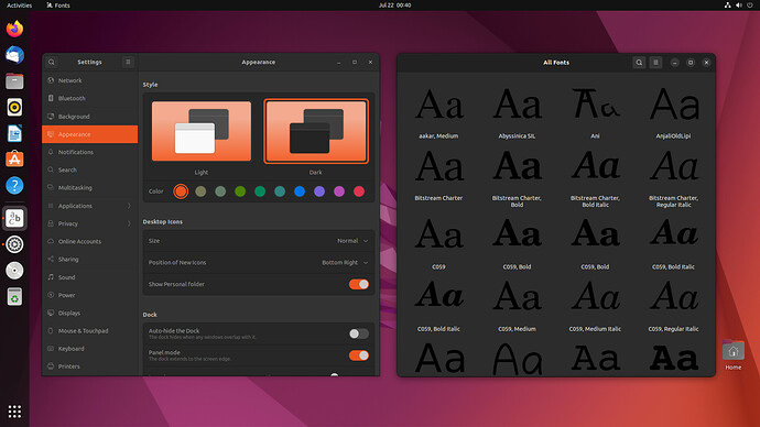
As an example, they showcase how PoP OS and Ubuntu fail with the theming. They say look at Ubuntu how badly it deals with the default Gnome Fonts app:
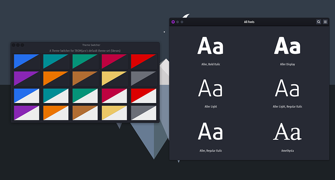
Bad contrast, black font preview with a dark theme. Guess how the same app looks on TROMjaro?
See? Theming done right. On Ubuntu is not that bad either, but how come TROMjaro, a 1.5 men team, does it better than Ubuntu!? Because we care about theming! It is not that difficult.
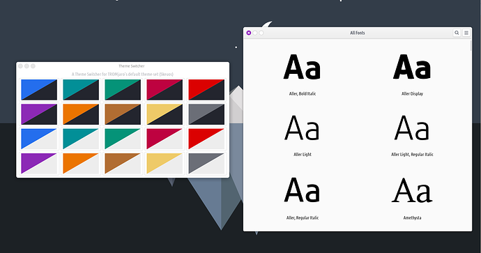
Here it is with a light theme in TROMjaro:
Looks Perfect!
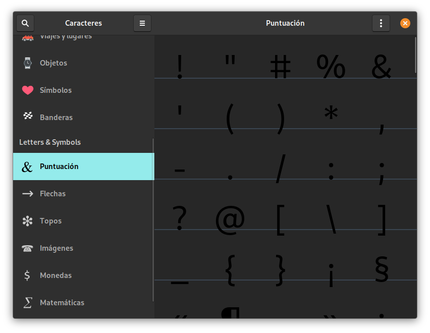
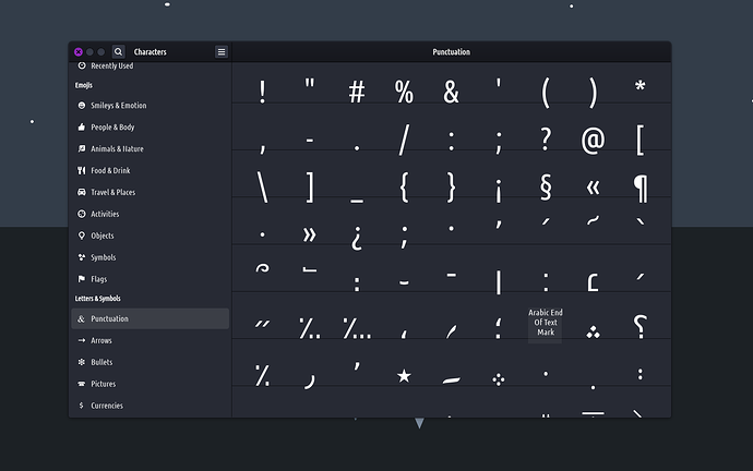
Another example they show us: look at the Characters Gnome app in PoP OS, again poor contrast and they said misplaced characters - I suppose they are referring to the dividing lines and how characters overlap:
I agree. Poor contrast. Not in TROMjaro:
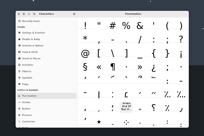
You could say characters misplaced too…but then I installed the “pure” Gnome Characters with Libadwaira and guess what? Yeah…characters misplaced:
Speaking of that, if I see this app in libadwaita form on my System, not respecting the theme (buttons, top bar, dark mode, font) then I will send a message to the devs.  Just saying!
Lastly they show us the app Contrast in PoP OS, and they say " White background in Contrast":
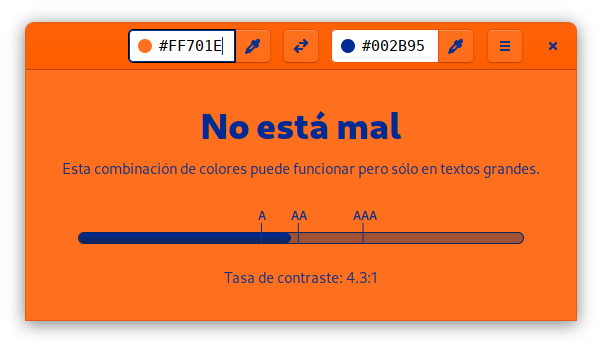
What do they want to say, that the color pick boxes are white on a Dark theme? If so, not in TROMjaro:
They exaggerate the issue by showcasing some PoPular OSes that do a bad job at implementing a proper theme. But I bet they do a bad job ALSO because Gnome or others, are very unfriendly at letting others theme their apps. So you have to kinda find hacky solutions like we did. The irony…if they made it easier for developers to theme their apps, then there will be less inconsistencies…
4. Gnome could still fix this nonsense.
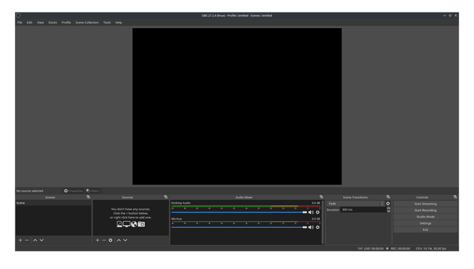
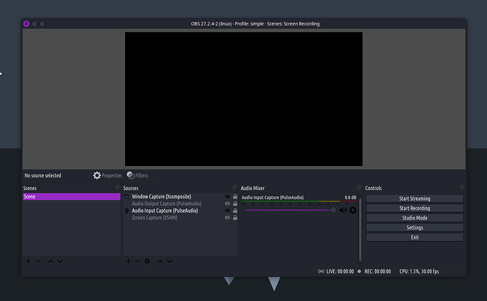
So they show us OBS as an example of how some QT apps are also an issue when it comes to custom theming. And this gives birth to two main issues with Gnome. First, they say look at OBS it looks like so on any system regardless of the theme:
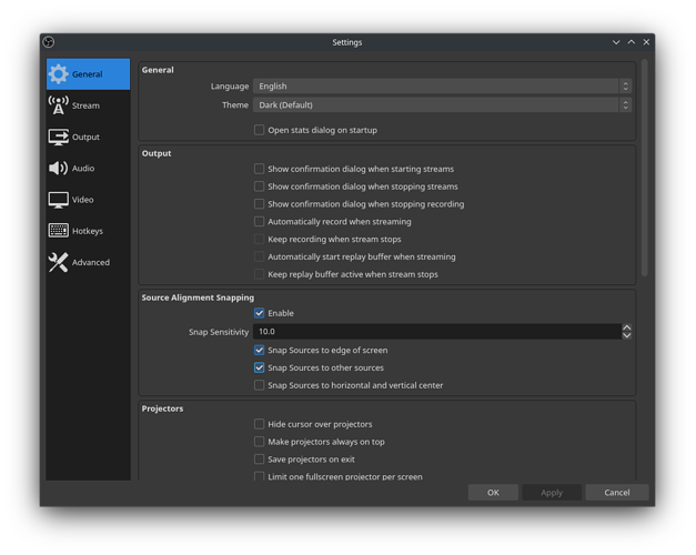
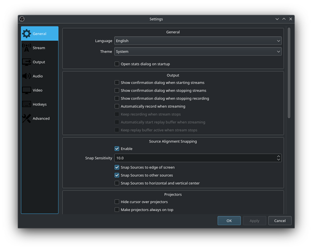
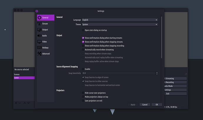
And I agree. It looks like that. That’s because OBS enforces their own theme, but in settings one can choose the system theme. And they say if you do that in KDE it still doesn’t look that good:
Poor contrast: dark button icons on a dark theme. And TROMjaro suffers from this too:
But let’s be honest, it is not that fuckin’ bad. I’ll put up with this for a very very few apps, and have a consistent desktop experience overall, rather than having 100 apps with 100 different themes. Any-day! On top of this I’d report this to the theme dev and icon dev, so they can fix these. Am sure they can. If not, it is ok. Relax Gnome!
But the core point here is that some apps respect the users and give them this option. If I dislike this “baaad” contrast in OBS I will select one of their built-in themes. They allow it. So why not is Gnome doing the same? Be friendly with the theme developers and make libadwaita easily themable, and also add an option to let users select a system’s theme. This way you can have your favorite libadwaita theme for any Gnome apps, plus a “broken” (as you think) system theme that the users can choose. See? Solution!
Second point about their QT example: is the Gnome team realizing the irony here? You show me a QT app that looks a little bit bad, a little bit, when themed in KDE with the system’s theme. But if OBS was GTK + Libadwaita it would not respect the theme at all! And no way to even let you select the system’s theme. Which one is better? Are these people blind, or am I going crazy?
Final thoughts:
Gnome sees itself as an isolated thing. Like a cult almost. As if you use Gnome only with the Gnome apps, preferably with Debian and only install the Gnome Apps from flatpak. This way you get the “pure” Gnome experience. But people on Arch + XFCE also wanna use the Gnome Apps, They have no freakin’ Gnome control center to change the theme to dark/light mode or select a highlight color. Gnome does not think about anyone but the devoted gnome users it seems.
They removed the top bar from the GTK apps, disabling a plethora of features for many systems, such as minimizing to the top bar a window, better integration with whatever desktop you are using, right click options in some cases, top panel integration, and more. Now the top bar in gnome apps looks huge and has no functionality other than saving a tiny bit of vertical space, as if that was important. They also killed the global menus…and now they wanna kill the theming.
But the thing is that they kill themselves. They might be cocky as to how big Gnome is, but Linux is far bigger. TROMjaro still has proper theming, even for the libadwaita apps via a hack, and still has a top panel integration with the windows, and global menus. There are only a few apps, the Gnome ones (funny, right!?), that ruin a bit the user experience: no global menus for them and no proper integration with the top bar.
Gnome does not care about the users if they remove features that are useful and necessary. They fantasize to become the Mac of Linux. And they may achieve their dream. And we should not care. Linux is much bigger.
Think about this:
If you use Debian + Pure Gnome + apps from their official repos, then at best your experience is limited. Gnome has a few apps compared to the vast universe of the Linux apps. And any other app that you install on this config, and is not a GTK LIbadwaita app, will look different on your desktop. No light/dark mode will work via the Gnome Control center…no highlight color…the window buttons will be different, the font may be different, the icon set for these other apps may be different. IN-CON-SIS-TEN-CY. So Gnome is a failure if they wanna be so purists. It only makes it a bit more annoying for some Linux users, and is breaking things on the desktop.
LATER EDIT:
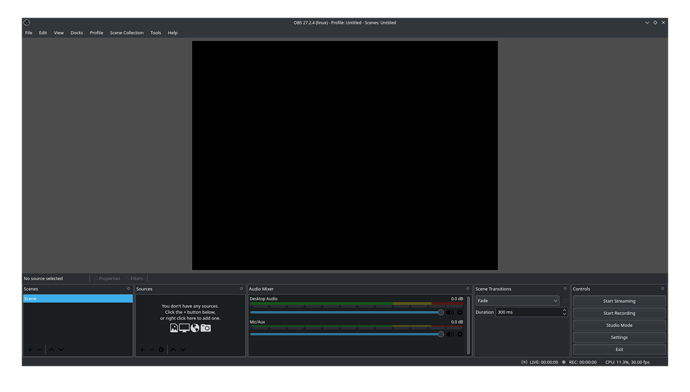
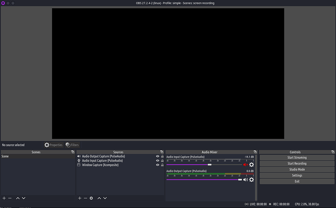
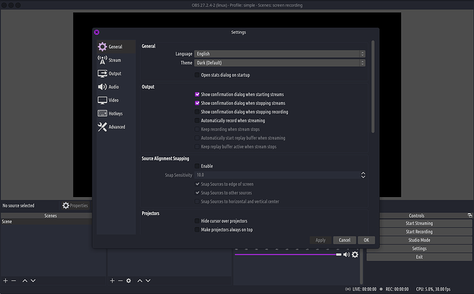
I just wanted to mention that I realized TROMjaro is actually theming OBS by default even when the Dark theme (default) is selected. And everything looks great. Here:
Take that GNOME! 
A bit later edit: I am unsure how that worked, but I can’t really replicate it. Weird. So you’ll “take that Gnome” you are right, this one does not play well with the system’s theme. But it is far from a disaster.
An even later edit: Follow this thread it seems that OBS does hard-coding for themes and breaks the theming in Windows too, same way. So it is not a relevant example for Linux. It is OBS’s problem.
Update 21/08/2022
They have updated the post to showcase how the situation is bad even on KDE, if they use QT5CT to theme the QT apps that cannot be themed. Remember KDE is QT based so even they, Gnome says, cannot properly theme their own kind. However this is the case if KDE chooses to use the QT5CT app alongside their own system’s theme, since only 1 can be used at a time.
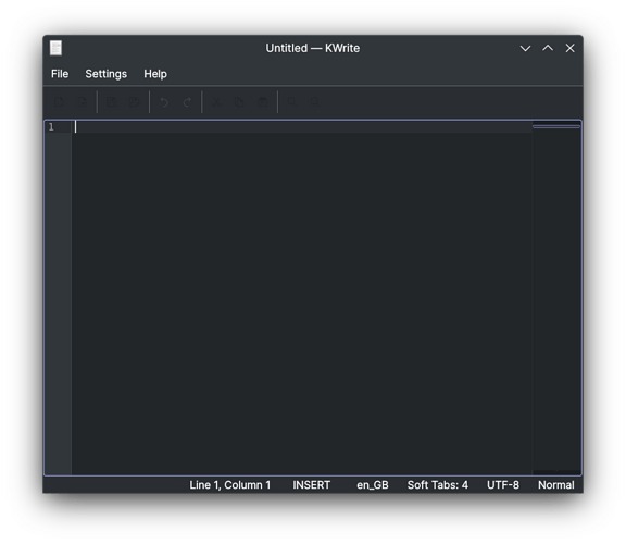
Here they show us a screenshot of one of KDE’s apps, KWrite.
Looks bad indeed. Those icons are not visible. But remember, this is an edge case where someone on KDE decides that a few QT apps cannot be themed, so they decide to go for QT5CT.
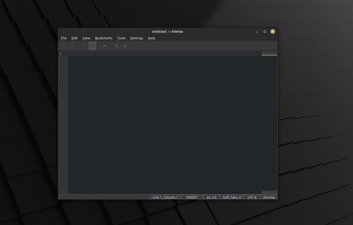
This QT5 Styling app is also used by Mint’s Cinnamon, a desktop environment that does the best in terms of theming. They are based on GTK but most QT apps are also themed on their desktop. They use similar methods to our own. However on their desktop too, the same KWrite app looks bad:
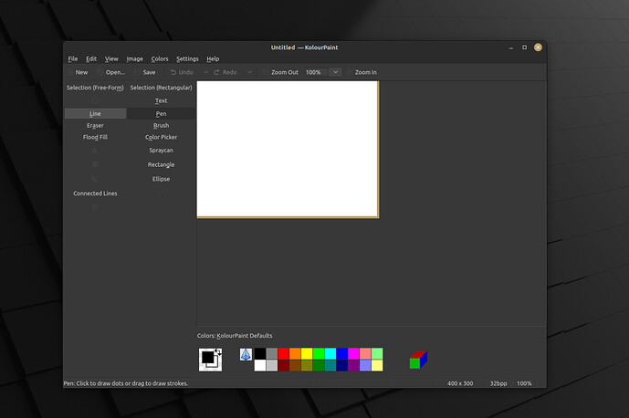
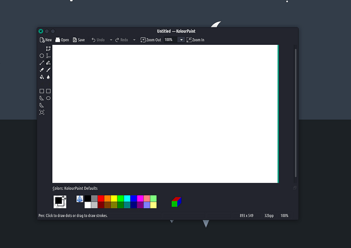
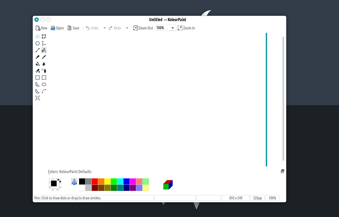
I tested two more KDE - QT apps: Kolour:
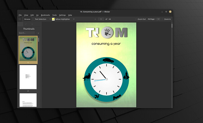
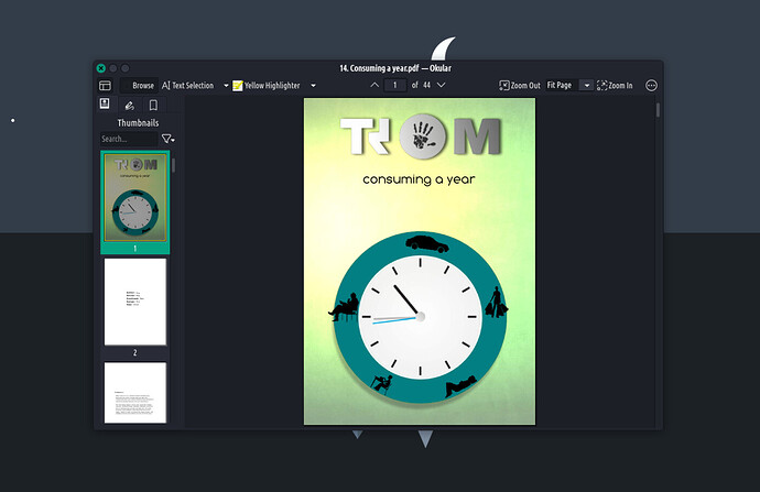
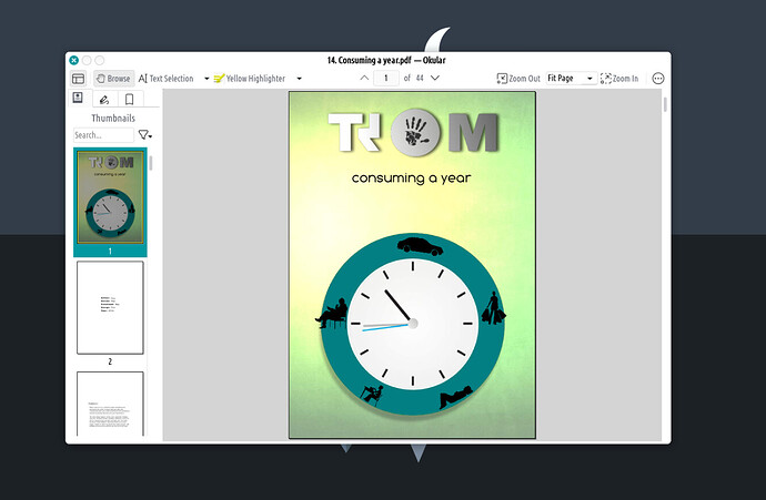
And Okular:
As you can see even the well polished Mate cannot handle this properly. This is not super bad tho, but it is for sure an issue. When you can barely see the icons…it becomes a problem of usability.
TROMjaro was performing the same. And then we understood where the issue is and we fixed it. Mind you we also use the QT5CT.
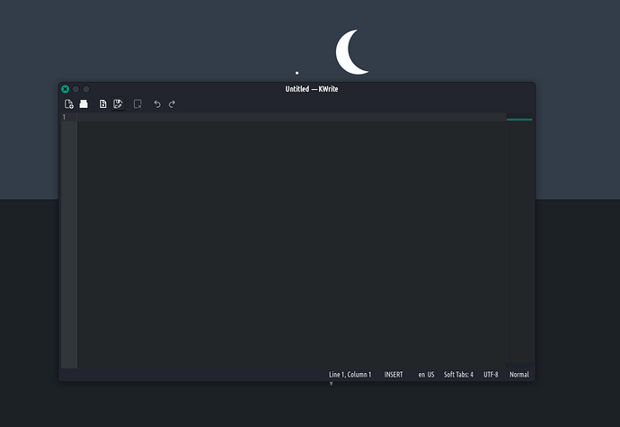
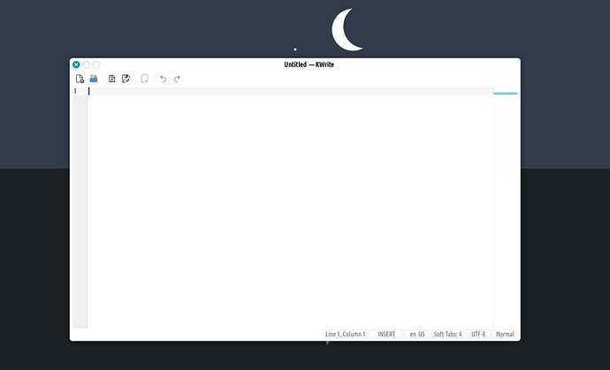
Now that “awful” KWrite looks perfectly fine on TROMjaro (both light and dark theme):
Kolour:
Okular:
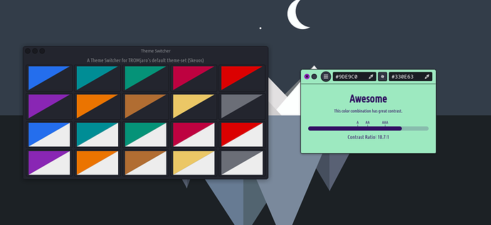
And all of these, mind you, are setup automagically from our Theme Switcher. Thus, so far TROMjaro showcases that IT IS possible to have a proper theming across different libraries.
I will make a new article detailing how we do it, so that others can do it too for their distros.
EDIT: Article here: How we theme TROMjaro
Probably final update:
We created packages for these fixes and improved them. You can find our package here.
